
Developer Studio from Fiserv
From Drop-Off to Self-Service: Redesigning the Support Experience

Introduction
Fiserv’s decades of acquisitions (First Data, Clover) left hundreds of APIs fragmented across legacy systems thus slowing down integration. Developer Studio was created to centralize and modernize API access into a single platform to help developers discover, integrate, and launch faster.
My Role as UX Designer
I led the redesign of the support experience for Developer Studio. I collaborated with UX designers and developers to complete the project.
Outcome
Developer portal engagement increased by 30% after the redesign measured across support resource usage, sandbox activity, and ticket submissions
Timeline & Team
Timeline: September 2021 - November 2021
My team:
2 UX Designers
5 Developers
Webby Award Honeree

What I inherited
Fiserv Developer Studio provides access to APIs used by third-party developers integrating payment and financial capabilities. While powerful, the API catalog and documentation were difficult to parse, particularly for developers wanting to try test out the APIs and onboarding for the first time.

Testing revealed three paint points for users
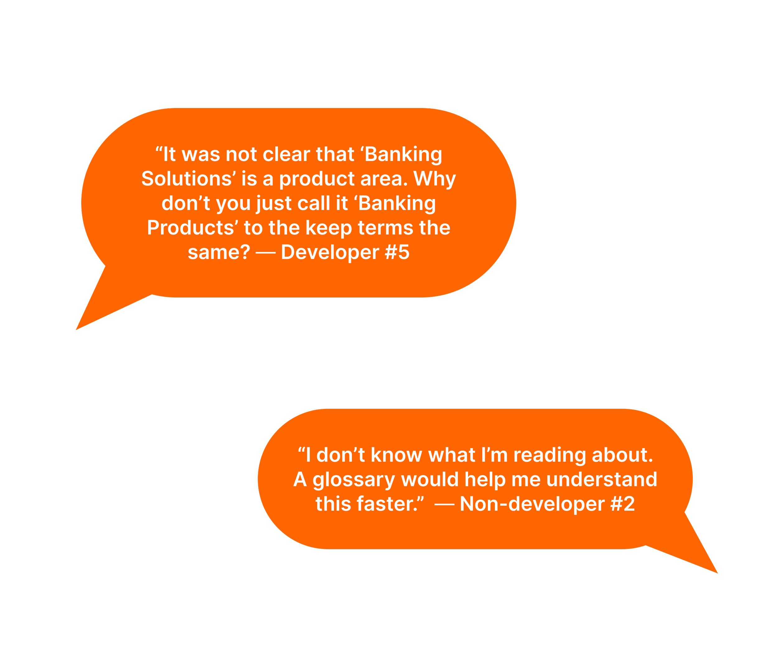
I started the project with gathering information around this problem. I ran a moderated usability testing via UserZoom with 8 participants—5 developers and 3 non-developers—to collect where they are dropping and why. There were three failure points:
Users couldn't understand the language. Terms like "Product Area," "Product," and "Endpoint" were Fiserv-internal concepts that meant nothing to users coming in cold.
Users couldn't find their way around. Even when they understood what they were looking for, the navigation didn't tell them where they were or what each section was for.
Users had questions the portal didn't answer anywhere.
Creating guides to alleviate friction and bring clarity
As a solution to address these pain points, I created the following based on user feedback:
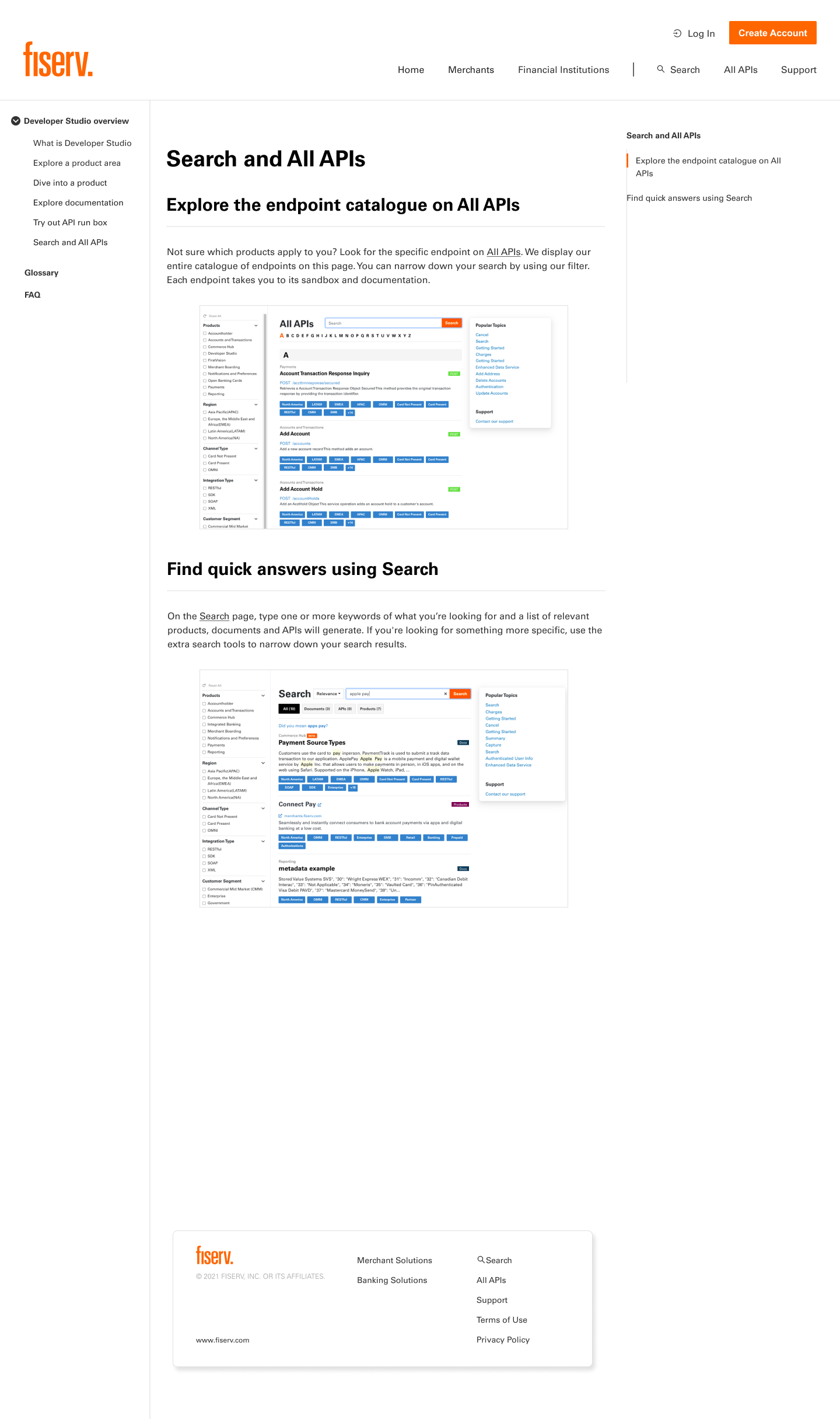
Glossary — a list of terms to clarify used exclusively on the portal
Navigation documentation — a step-by-step guide explaining the structure of the portal and the purpose of each page, written for someone encountering it for the first time.
FAQ — the questions users were asking but had no path to answer on their own.
Validating the guides
I ran a second round of usability testing once the documentation was built. Users completed all tasks successfully but there was feedback the navigation documentation was too dense. Users were spending disproportionate time on it, working through a wall of information when they just needed a specific answer. The guide was doing its job but it was making users work too hard to get there. I broke the navigation documentation into smaller, focused sections so users could find exactly what they needed without reading everything around it.
The Glossary and FAQ tested well with no major structural changes needed. Users found both resources clear and useful as standalone references.


Prioritizing what’s important on the Support landing page based on usability results
The existing Support Page had seven resource cards — five linked to GitHub, two leading to the same URL, one to YouTube with no API-relevant content, and one to Slack. It wasn't a support system. It was a list of places to go that mostly led nowhere useful.
For the redesigned Support Page, I expanded the layout to nine cards and reorganized content based on user feedback:
The top section highlights high-priority resources addressing the most common user questions—such as Product Area, Product, and how to access the API sandbox.
The middle section focuses on learning resources, including the FAQ, Glossary, and Community Posts, to help users self-serve and learn independently.
The bottom section provides ways for users to reach out directly, such as through GitHub.
Reflections & next steps
Content clarity is a conversion lever. Unclear terminology is a drop-off risk just as much as a broken flow.
Behavioral design doesn't have to be complex. A reference guide that users can pull up at the moment of confusion is a behavioral intervention.
If given more time, I would want to validate time-to-completion metrics such as endpoint selection accuracy and support ticket reduction post-launch.